The Beginner's Guide to Prototyping (2026)
A complete guide to prototyping in UX design: definition, lo-fi vs hi-fi, step-by-step process, best tools, and common mistakes to avoid.
Updated 14 min read
A complete guide to prototyping in UX design: definition, lo-fi vs hi-fi, step-by-step process, best tools, and common mistakes to avoid.
Prototyping is the process of creating an interactive, testable model of a product to validate design concepts and gather user feedback before development begins. Figma describes it as the bridge between a design idea and something real users can actually touch. The goal is to surface problems, align stakeholders, and reduce risk, all before a developer writes a single line of code.
Fixing a UX problem at the prototype stage costs a fraction of what it costs to fix it post-launch. Forrester Research found that companies using prototyping reduce development costs by up to 33%. And Forrester Consulting found those same companies reach market up to 50% faster.
This guide covers everything you need to know about prototyping, from the core concepts and fidelity levels to step-by-step process, the best tools, and the mistakes that waste the most time.
Prototyping is the act of creating a preliminary model of a product so you can test assumptions, gather feedback, and iterate before committing to a full build.
It happens during the research and development phase, typically before developers begin coding, and sometimes again near the end of the design phase before final rollout. The principle is the same as in manufacturing: build something testable, get feedback fast, and improve before it's expensive to change.
Three terms often get confused:
Prototypes go beyond blueprints and graphic representations. As Figma explains, they're more functional and will generate keener insights from real users than wireframes or static mockups alone.
Products that skip prototyping pay for it downstream. The cost of changing a design in Figma is an hour. The cost of changing a feature after it ships is weeks of engineering time, a QA cycle, and a deployment.
Nielsen Norman Group research shows companies prioritizing UX design can increase customer loyalty and revenue by up to 240%. Prototyping is where UX design earns that return.
IDEO, one of the world's leading design firms, operates by a simple principle: if you want to succeed sooner, you have to fail earlier. Their 7 prototyping principles push teams to build early, often, and repeatedly, because each iteration answers a question that planning alone can't answer.
The prototyping process is iterative, not linear. You define a question, build the minimum prototype to answer it, test it with users, and use what you learn to build the next version. The cycle repeats until the design is validated.
Every prototype must start with a specific question. Without one, you're building for the sake of building.
"Will the prototype be used to test a new website? A specific checkout flow? Who are the stakeholders? What does success look like?" Answering these questions before opening any tool is essential to keeping the prototype focused.
Good goal examples:
Fidelity refers to how closely the prototype resembles the final product. The right fidelity depends on the stage of the design process and the question you're trying to answer.
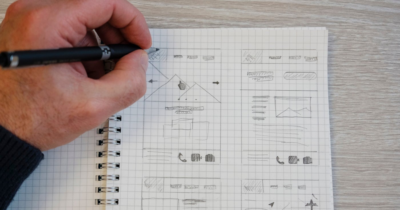
Low-fidelity (lo-fi): Rough, quick, cheap. Paper sketches, whiteboard flows, or basic wireframes without color or real content. Use lo-fi prototypes to test structure, navigation, and user flows before investing in visuals.
Medium-fidelity: Digital wireframes with basic interactions but no visual polish. Good for testing user flows across multiple screens.
High-fidelity (hi-fi): Interactive prototypes with real UI, colors, typography, and micro-interactions. Use hi-fi prototypes for usability testing close to launch, stakeholder demos, and developer handoff.
NN/G's research on lo-fi vs hi-fi prototypes shows a consistent pattern: users give more honest feedback when something looks rough. When a prototype looks finished, people hesitate to criticize it. Low-fidelity prototypes test information architecture and flows; high-fidelity prototypes test UI and interaction feel.
Once you know the goal and fidelity level, build it.
For lo-fi: paper and a pen, or a whiteboard. Connect the screens with arrows. For digital: use a tool like Figma, UXPin, or Sketch to create screens and link them into clickable flows.
A core principle from NN/G's prototyping research: sketch your ideas before going digital. Committing too early to a tool forces you to focus on layout details instead of solving the core problem.
IDEO's principles add an important nuance: build to think, not to show. The purpose is learning, not impressing. A prototype that looks polished often signals you've over-invested in fidelity before validating the concept.
Two practical rules for building:
Internal review is not a substitute for user testing. Your team knows the product too well to see it as a new user would. NN/G makes this point clearly: an internal review does not replace a usability test. The team knows the product too well to spot the issues a new user identifies in seconds.
Classic usability testing with just five users uncovers up to 85% of usability issues, according to NN/G research. You don't need a large sample.
During testing, observe without guiding. Give users a realistic task, then watch silently. Your job is to watch what users do, not tell them what they should do. The friction points are the data.
Structured usability sessions follow a simple format:
Each testing context requires different things from the prototype: usability testing validates user journeys, stakeholder review aligns on business goals, and developer walkthroughs clarify specifications.
Incorporate what you learn. Revise the sections that failed. Leave what worked. Build the next version and test again.
As Harvard Business School describes rapid prototyping: "doing is the best thinking." Building and testing in the real world provides more insight than planning alone. Use materials that keep pace with your ideas.
Iteration is not the same as making the changes users suggest. Users surface problems; designers solve them. A user who says "I didn't know where to click" is identifying a navigation problem.
The solution might be a label change, a layout adjustment, a progressive disclosure pattern, or something entirely different. Prototype the solution, test it again.
The cycle continues until the design answers all your critical questions. Then it moves to development.
Lo-fi prototypes are simple, fast, and designed to be thrown away. The low investment is the point: if it's cheap to make, it's cheap to discard, and you can explore more ideas before committing.
Paper prototyping is the fastest form. Physical "screens" laid on a desk or taped to a whiteboard let teams visualize flows together without any tool knowledge required. NN/G notes that paper prototyping is particularly valuable during design sprints when time is limited and rapid collaboration is the goal.
Digital wireframes are the next step up: black-and-white screen layouts created in tools like Figma or Sketch, connected with basic click interactions. They test navigation and structure without visual distraction.
When to use lo-fi:
Low-fidelity methods are best for brainstorming and selecting between conceptual models. Medium and high fidelity are better for fine-tuning once you've committed to a direction.
Hi-fi prototypes simulate the final product closely: real colors, typography, animations, and actual content. They're interactive and designed to feel like the finished app.
Hi-fi prototypes are better for:
The risk with hi-fi is over-investing before the concept is validated. If your concept is wrong, a polished prototype just means more work to throw away. NN/G research recommends matching fidelity to the stage: validate concept structure with lo-fi first, then add visual polish only after the flows work.
Rapid prototyping applies the prototyping principle at maximum speed. The goal is validation in days, not weeks.
Rapid prototyping follows three steps repeated in quick cycles: prototype, test, refine. Tulio Domingos, Product Manager at Glovo, frames the mindset simply: "Prototyping is about answering questions."
HBS identifies three principles that make rapid prototyping work:
Rapid prototyping is especially effective for de-risking large bets. Catching design problems at the prototype stage costs a fraction of fixing them in production, where changes can be 100x more expensive than fixing the same issue earlier.
Prototyping is Phase 4 of the Design Thinking framework: Empathize, Define, Ideate, Prototype, Test. It's the bridge between ideation and validation, converting abstract solutions into testable experiences.
In Design Thinking, a prototype is not a finished product. It's a hypothesis: you build it to test whether your solution from the Ideate phase works in the hands of real users.
IDEO's Jacquard jacket, built with Google and Levi's, is a canonical example. The team explored hundreds of prototypes, from 3D-printed shapes to sewn straps to overmolded silicone assemblies, to find the best version of a smart garment interface. Each iteration answered a new question. The final product launched successfully.
Choosing a prototyping tool depends on your workflow, team size, and the fidelity you need. Below are the most widely used options, with pricing pulled directly from each tool's official page.
Tool | Best For | Free Plan | Starting Price |
|---|---|---|---|
Teams, web/mobile, real-time collaboration | Yes (Starter) | €16/mo (Professional) | |
Coded prototypes, AI features, advanced logic | 14-day trial | $29/mo (annual) | |
Axure RP | Complex interactions, conditional logic | No | Paid only |
Proto.io | Drag-and-drop, mobile-first | No | Paid only |
Sketch | Mac, web/mobile, vector editing | No | Paid only |
ProtoPie | Advanced micro-interactions | No | Paid |
Figma is the dominant tool in the market for good reason: real-time collaboration, a generous free tier, and prototyping built directly into the design environment. You design and prototype in the same file, which eliminates the handoff problem between static designs and clickable demos.
The Starter plan is free with unlimited drafts. The Professional plan at €16/mo unlocks unlimited files, advanced prototyping, and developer handoff features. For most UX teams, Professional is the right entry point.
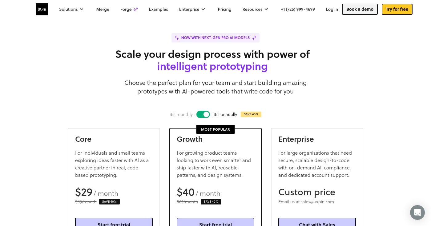
UXPin takes a different approach: prototypes built with real, code-based components. This means interactions behave exactly like production code, eliminating the gap between "it works in Figma" and "it works in the app."
The Core plan starts at $29/mo (billed annually) and includes unlimited prototypes, conditional logic, variables, and built-in coded component libraries. The Growth plan at $69/mo adds design systems and Storybook integration.
Axure is the go-to tool for complex prototypes that require conditional logic, adaptive views, and multi-state components. The learning curve is steeper than Figma, but for enterprise-scale prototyping with sophisticated interaction requirements, it's hard to match.
The most common mistake is opening a prototyping tool before answering: what question does this prototype need to answer? Without a goal, the prototype sprawls, the test is unfocused, and the results don't inform any real decision.
Define the specific question before building anything. Use SMART goal criteria: specific, measurable, achievable, relevant, time-bound.
It's tempting to skip paper prototypes and wireframes and go directly to a polished Figma mockup. The problem is that you lock yourself into a visual design before validating the underlying concept.
If the concept is wrong, a hi-fi prototype means more work to discard. Start with the lowest fidelity that can answer your current question, and only increase fidelity once the structure is validated.
A prototype doesn't have to be perfect. It has to be good enough to answer a question. IDEO's prototyping principles are explicit on this: build to think, not to show. If your prototype takes more than a week to build, you're doing development, not prototyping.
Set a time-box: two to three days maximum per prototype iteration. If a detail doesn't affect the validation, leave it unresolved.
Internal review catches nothing that matters in usability testing. Your colleagues know the product too well, know what buttons do, and will forgive confusing flows without realizing it.
Always reserve time for testing with real users who match your target audience. If there's no time to test, there was no time to prototype.
Prototype testing reveals what's broken. It doesn't tell you how to fix it. Users identifying a problem in navigation doesn't mean you implement their suggested solution; it means you investigate the root cause and prototype a few approaches before committing to one.
A prototype tested once and never revised is just an expensive wireframe. The value is in the cycle: build, test, learn, revise, test again. Prototyping is inherently iterative, as NN/G's usability research consistently demonstrates. One round of testing is a starting point, not a conclusion.
When IDEO partnered with Google and Levi's to build the Jacquard jacket, the team faced a genuinely novel design problem: embedding touch-sensitive controls into denim fabric that cyclists could activate with a brush of their sleeve.
The team explored hundreds of prototype variations to find the right form for the smart tag: 3D-printed shapes to test ergonomics, sewn fabric straps to test durability, overmolded silicone assemblies to test water resistance and feel. Each version answered one specific question before moving to the next.
The lesson isn't that you need hundreds of prototypes. It's that each iteration addressed a specific unknown. That precision is what made the project succeed without wasting resources building toward assumptions that might be wrong.
Prototyping is the most cost-effective step in the UX design process. It converts assumptions into evidence before development starts, and the evidence is cheap to act on. The Forrester ROI data makes the case concrete: 33% reduction in development costs, 50% faster time-to-market.
Start your next project with a paper prototype. Define one question, build the minimum version to test it, and let five real users show you what doesn't work. The answer will be worth more than any amount of planning.