The Complete Guide to Usability Testing (2026)
A complete guide to usability testing for UX designers: 7 methods, the 5-user rule, a 6-phase process, 8 tools compared by price, and 8 mistakes to avoid.
Updated 18 min read

A complete guide to usability testing for UX designers: 7 methods, the 5-user rule, a 6-phase process, 8 tools compared by price, and 8 mistakes to avoid.
Usability testing is a UX research method where you observe real users completing tasks with your product to identify friction, uncover opportunities, and learn how people actually behave. Nielsen Norman Group defines it as having a facilitator ask participants to perform tasks on one or more interfaces while the researcher observes and listens for feedback. The method is sometimes called user testing, though the terms overlap rather than mean the same thing.
The business case is straightforward: only 55% of companies currently conduct any type of usability testing, which means the majority ship products without direct evidence of how users experience them. This guide covers everything you need to close that gap, from choosing the right testing format to analyzing what you find.
This guide covers the full usability testing process, including methods, participant recruiting, tools, common mistakes, and how AI is changing the field in 2025 and 2026.
Usability testing is a type of user research that evaluates your product by watching real people attempt to complete realistic tasks with it. Designers and product teams use it to assess how intuitive and easy-to-use a product is, and to identify problems before they reach production or compound after launch.
The word "usability" itself has a precise definition. Whitney Interactive Design describes it through five dimensions, sometimes called the 5 E's: effective, efficient, engaging, error tolerant, and easy to learn.
Effective means how accurately users reach their goals. Efficient covers how quickly they complete tasks. Engaging is how satisfying the interaction feels, error tolerant is how well the design prevents mistakes, and easy to learn is how quickly new users get up to speed.
Usability testing is not the same as user testing, though the terms are often used interchangeably. User testing is broader and can include desirability testing, value testing, and concept validation. Usability testing specifically focuses on ease of use and task completion.
The economic argument for usability testing has never been stronger. Research consistently shows that investing in UX before development beats fixing problems after launch. Problems in development are 10 times more expensive to fix than issues caught during design, and UX research can reduce project development time by up to 50% by catching issues early.
The downstream business impact is equally clear. Enhanced UX design can lift conversions by up to 400%, and 80% of users say they are likely to pay more for a better user experience. A Forrester Total Economic Impact study commissioned by UserTesting found that enterprises achieved a 415% ROI over three years, with a payback period of under six months and a net present value of $7.6 million.
Churn is the other side of the equation. 32% of customers will walk away after a single bad experience, and 91% of unhappy customers do not complain: they just leave. Usability testing lets you catch the friction before users vote with their feet.
Usability testing follows a consistent six-phase cycle regardless of whether you run moderated in-person sessions, async remote tests, or quick guerrilla interviews. The format and tools change; the logic does not.
Every test needs a specific question to answer before you write a single task. Vague goals produce vague results. Instead of "see how users feel about the new checkout flow," aim for "identify where users abandon during the three-step checkout and why."
Write objectives in a simple format: "Can [user type] complete [task] with [product area]?" Specify the stage you are testing (prototype, beta, or live) because the stage determines what failure is acceptable.
One well-scoped test answering three focused questions is more useful than a sprawling session attempting to cover an entire product. Treat each round of usability testing as a targeted investigation, not an annual audit.
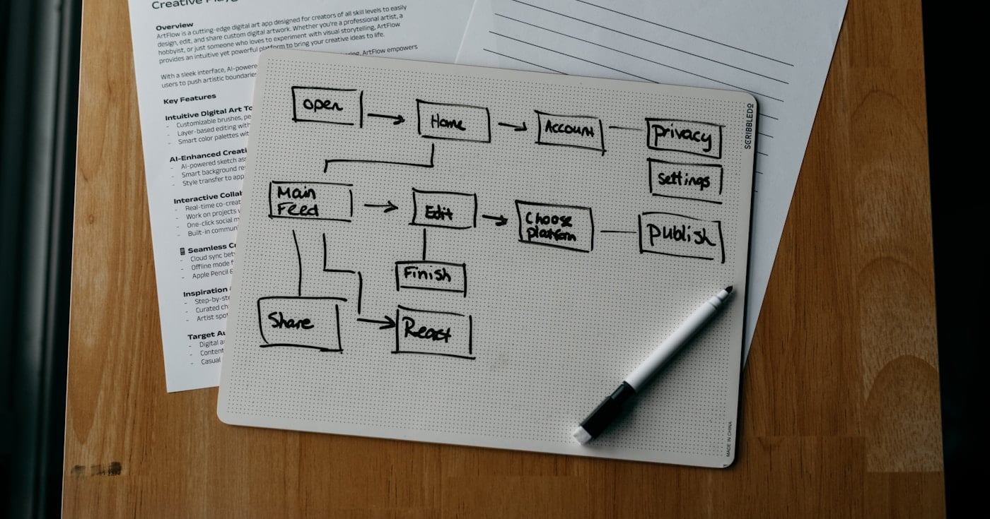
A test plan documents your objectives, participant criteria, tasks, session structure, and success metrics. It serves as the brief for your team and the script for your sessions.
Tasks are the heart of the plan. A good task is scenario-based and written in neutral language.
"You want to upgrade your subscription to the Pro plan. How would you go about doing that?" is a strong task. "Can you find the upgrade button?" is not: it tells users what to look for, removing the friction you want to observe.
Define success metrics before the session, not after. Common quantitative metrics include task completion rate, time on task, error rate, and the System Usability Scale (SUS) score. For qualitative tests, your metrics are observations and verbal feedback rather than numbers.
Participant quality determines the validity of your findings. Testing the wrong people gives you data that looks real but does not reflect your actual users.
The most practical starting point for recruiting is Jakob Nielsen's 5-user rule: for a single user segment in a qualitative study, five participants will uncover approximately 85% of usability problems. After five sessions, each additional user adds fewer new insights, and the marginal return drops sharply.
If your product serves multiple distinct user types, recruit five users per segment. If you are benchmarking against competitors or running quantitative studies, you will need a larger sample (typically 20 or more). For iterative testing, run five sessions, fix what you find, then run five more: each round surfaces problems that the previous round obscured.
Recruiting sources include screener surveys sent to existing users, external panels such as User Interviews and Respondent.io, and the built-in participant panels offered by tools like UserTesting, Lyssna, and Maze.
Open every session with a brief introduction: explain that you are testing the product, not the participant, that there are no wrong answers, and that honest reactions help more than polished feedback. Establish the think-aloud protocol clearly: ask participants to narrate their thoughts as they work through tasks, not just after.
During the session, your job is to observe rather than guide. When a participant gets stuck, resist the urge to help. Their struggle is your data.
Neutral follow-up prompts like "What are you expecting to happen?" or "What would you do next?" keep the session moving without contaminating results.
Record screen, audio, and ideally video. You will catch behavioral cues you missed in the moment, and video clips are far more persuasive in stakeholder presentations than text notes.
After sessions, look for patterns rather than outliers. If one user had trouble with a specific button, it may be noise. If three out of five users could not find the same navigation item, it is a signal.
A rainbow spreadsheet is a practical analysis tool: list tasks in rows and participants in columns, then color-code each cell by outcome (green for success, yellow for partial success, red for failure). Patterns become visible at a glance.
Categorize each finding by severity: critical issues (task failure or serious confusion) get fixed first; major issues (friction but eventual success) come next; minor issues (aesthetic preferences, small inconveniences) go on a backlog. Severity ratings help product teams prioritize without debating every finding in a room.
Present findings with video clips, not just text. A 30-second clip of a user saying "I have no idea where to go" lands differently than a bullet point. Stakeholders who did not attend need evidence they can see.
Prioritize fixes by impact and feasibility, not just by how often an issue appeared. A critical blocker that affected two users may warrant immediate attention; a minor polish issue that appeared in every session may not be worth the sprint capacity.
Schedule re-testing after fixes ship. Usability testing is not a one-time event. The teams that get the most value from it build recurring testing into their product development cycle rather than treating it as a milestone deliverable.
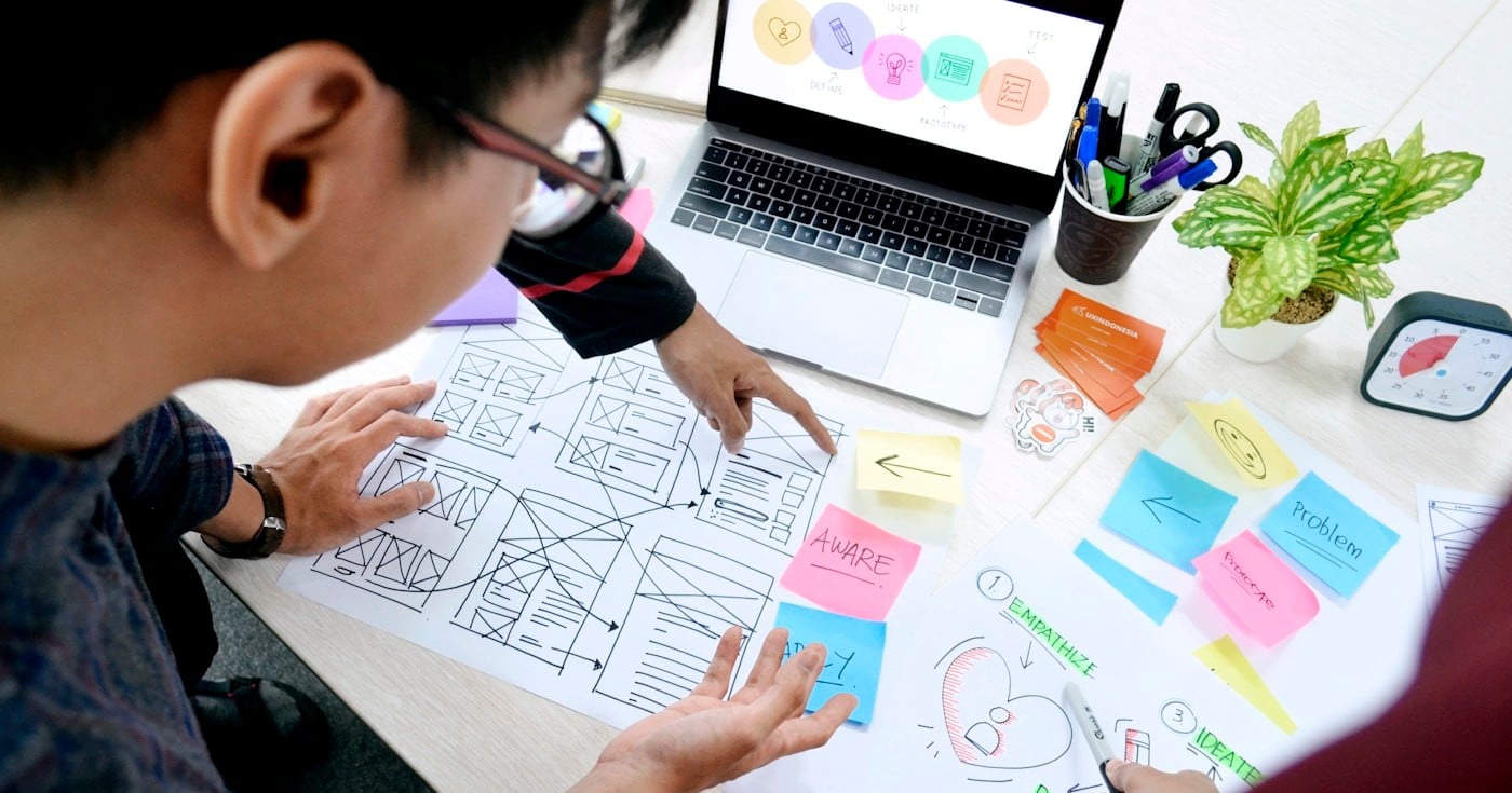
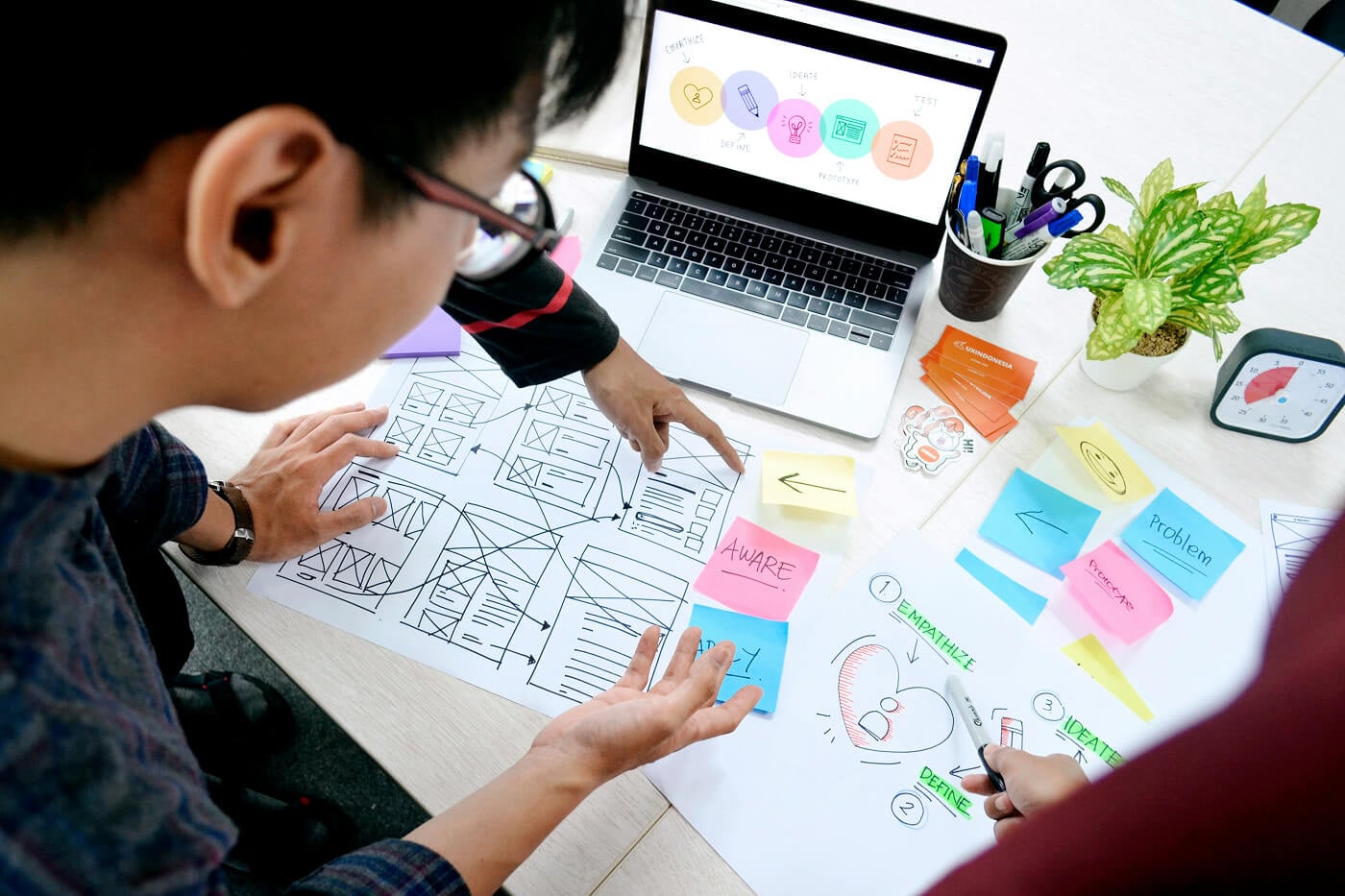
Not all usability tests look the same. Maze identifies seven core methods, each suited to different research questions, budgets, and timelines.
Method | Format | Best For | Sample Size |
|---|---|---|---|
Lab testing | In-person, moderated | Deep behavioral observation with full control | 5-8 |
Contextual inquiry | In-person, in user's environment | Understanding real-world usage context | 5-10 |
Guerrilla testing | In-person, informal | Quick validation, early-stage ideas, low budget | 5-10 |
Video/phone interview | Remote, moderated | Structured tasks + follow-up across geographies | 5-8 |
Session recording | Unmoderated, live product | Behavioral patterns at scale on live sites | 50-500+ |
Tree testing | Remote, unmoderated | Information architecture and navigation structure | 30-50 |
A/B testing | Remote, unmoderated | Comparing two design variants with statistical confidence | 100+ |
Lab usability testing takes place in a controlled environment, usually a dedicated research facility or a quiet conference room. The facilitator and participant are in the same physical space.
This format allows for detailed behavioral observation, the use of eye-tracking hardware, and real-time probing. It also tends to be the most expensive format and the hardest to schedule at scale.
Contextual inquiry moves the session into the user's natural environment: their home, their office, or wherever they actually use the product. You observe and occasionally ask questions, but the user leads. This method surfaces environmental factors (interruptions, device limitations, workflow constraints) that lab testing cannot replicate.
Guerrilla testing is informal, fast, and cheap. You approach people in coffee shops, libraries, or coworking spaces and ask them to spend a few minutes on your product.
Sessions are short (5-15 minutes) and the questions are simple. Guerrilla testing works best for early validation of ideas or navigation concepts, not for detailed task analysis of a complex product.
Session recording tools like Hotjar, FullStory, and Smartlook capture how real users interact with your live product without recruiting or scheduling. You review recordings to spot rage clicks, hesitation, and drop-off patterns. The method is unmoderated by nature, so you observe behavior without knowing the "why." It pairs well with follow-up surveys or targeted interview recruiting.
Tree testing evaluates your information architecture in isolation, before any visual design is applied. Participants navigate a text-only version of your site structure to find specific items.
If they cannot find a product category without the visual cues of your homepage, your IA has a structural problem rather than a visual one. Optimal Workshop specializes in this method.
The moderated vs. unmoderated distinction shapes everything else about your test: cost, timeline, depth, and what you can do with the data.
Moderated tests involve a live facilitator who guides participants in real time, whether in person or over video call. The facilitator can ask follow-up questions, prompt participants to think aloud when they go silent, and redirect if the session goes off track.
The trade-off is cost and speed. Moderated sessions typically take 45-60 minutes each, require scheduling, and generate large amounts of data that take time to analyze. For high-stakes design decisions, a complex product with many edge cases, or a research question that requires understanding "why" rather than just "what," moderated testing is usually the right choice.
Unmoderated tests let participants complete tasks on their own schedule, using tools like Maze, Lyssna, or UXtweak that present tasks and capture responses automatically. You can run 20 sessions simultaneously and have results the same day.
The limitation is depth. Without a facilitator present, you lose the ability to ask follow-up questions or probe unexpected behavior.
Dr. Eduard Kuric writing for Smashing Magazine notes that AI-powered questioning is beginning to close this gap. Tools now detect when a participant hesitates and generate contextual prompts automatically, though the approach needs careful validation to avoid introducing bias.
For rapid iteration cycles, early-stage prototype testing, or when you need quantitative task completion data across a larger sample, unmoderated testing is often the faster and more cost-effective choice.
The right tool depends on your research format, budget, and whether you need built-in participant recruiting.
Tool | Best For | Starting Price | Free Plan |
|---|---|---|---|
AI-first prototype testing, unmoderated studies | $99/mo | Yes | |
All-in-one research platform, value for teams | $82/mo | Yes | |
Session recordings and heatmaps on live sites | From $39/mo | Yes | |
Moderated sessions, screen recording, collaborative review | $299/yr | No | |
Tree testing and card sorting for information architecture | $199/mo | No | |
Enterprise-scale research with a large participant panel | ~$40,000/yr | No | |
Broad toolkit with competitive pricing | €92/mo | Yes | |
Customizable studies with a large panel | $699/mo | No |
Maze is the leading choice for teams running unmoderated prototype tests at speed. Its AI question-rephrasing feature and direct Figma integration make it easy to go from prototype to test in under an hour. The Starter plan at $99/month includes unlimited blocks, conditional logic, and CSV exports.
Lyssna (formerly UsabilityHub) is strong for teams that want an affordable all-in-one platform covering preference tests, five-second tests, and navigation studies. Its free plan supports three seats, and the Starter plan at $82/month is one of the most competitive entry prices in the category.
Hotjar occupies a different niche: it runs continuously on your live product rather than in scheduled test sessions. Heatmaps, session recordings, and on-page feedback widgets give you behavioral data from real users at scale. It does not replace task-based usability testing but complements it well for identifying where to focus your next study.
UserTesting is the enterprise standard. Its panel of verified participants and AI-powered insight features are best suited to large research teams with corresponding budgets. Pricing typically starts around $40,000 per year and is not publicly listed.
Even experienced teams fall into predictable traps. Here are the eight most common mistakes, drawn from practitioner research by UXArmy and Nikki Anderson (The User Research Strategist).
Internal team members know your product too well. They automatically compensate for confusing labels and broken flows because they helped build them.
Internal testing can catch obvious bugs, but it will never surface the friction first-time users encounter. Always validate with external participants who match your actual user persona.
Testing after launch forces you to choose between shipping broken experiences and stopping development. Both are expensive. Start testing wireframes or low-fidelity prototypes before you commit to any code.
Early discovery is not about perfection. It is about avoiding the rework that comes from finding a navigation problem three sprints into implementation.
"Did you find that easy to use?" is a leading question. "Was there anything confusing?" is also leading. The phrasing steers participants toward a particular answer before they have formed their own.
Use neutral prompts instead: "What would you do next?" or "What were you expecting to see here?" These keep the session moving without contaminating the data.
Recruiting criteria matter as much as the test itself. Testing a B2B procurement platform with general consumers, or a medical records app with users who have no healthcare background, produces observations that do not transfer to your real audience. Write a screener that matches your actual user persona, including industry, role, experience level, and product familiarity.
"Explore the site and tell me what you think" gives participants no direction. "Click the Settings icon in the top right corner" tells users where to go, removing the discovery you want to observe.
The sweet spot is a scenario-based task: "You received an email saying your subscription is about to expire. What would you do?" The scenario provides context; the task reflects how users think about their goals.
Silent observation tells you what users do but not why. Participants who narrate their thoughts reveal the mental models and vocabulary they bring to your product.
The think-aloud protocol is simple: ask participants to say out loud what they are thinking as they work through tasks. Brief them before the session and remind them gently during it.
A single round of usability testing is a snapshot. Iterative testing is the practice: run a round, fix the critical issues, then run another round.
The second round surfaces problems hidden by the first round's bigger issues. Teams that budget for only one round typically skip re-testing. Build recurring testing into your sprint cycle rather than treating it as a milestone.
Text summaries of usability problems rarely move stakeholders to act. A 30-second clip of a user saying "I have no idea where to go" lands differently than a bullet point.
Every test that involves screen recording should produce a small library of video highlights. Tools like Maze, Lookback, and Dovetail make it easy to tag and clip moments after sessions.
The practice is evolving quickly, driven largely by AI integration and the continued shift toward remote and unmoderated formats.
The most time-consuming part of usability testing has traditionally been synthesis: reviewing hours of recordings, clustering observations, and writing up findings. AI tools embedded in platforms like Maze, Lookback, and UserTesting now auto-generate session summaries, tag behavioral patterns, and surface highlight clips with minimal manual work. Teams that previously spent two to three days on analysis are reducing that to a few hours.
Unmoderated testing has moved from a budget compromise to a first-choice format for many product teams. A Smashing Magazine analysis by Dr. Kuric notes that unmoderated testing's main limitation (the inability to ask follow-up questions) is now being addressed by AI interviewers.
These tools detect hesitation and deviation in real time and generate contextual probes. This closes the qualitative depth gap while preserving the scalability advantage.
Rather than large quarterly studies, many design-mature teams now run smaller weekly or biweekly tests with two to three participants. The State of User Research 2025 report found that methods are shifting toward more frequent, lighter-weight touchpoints rather than episodic large studies. This "always-on" model feeds faster design cycles and reduces the temptation to ship without feedback because the next test is always close.
Tools like Sprig embed research directly into your live product, capturing feedback during real usage rather than in a simulated session. Rather than recruiting participants for a scheduled test, you trigger a short survey when a user completes a specific flow.
The context is authentic and the friction is unperformed. This approach complements but does not replace dedicated usability testing sessions.
Consider a SaaS team working on a new onboarding flow. Their activation rate has stalled at 34%, and users are dropping off before completing the setup wizard.
They run a five-person moderated usability test using Maze to share the Figma prototype remotely. In the first session, the participant completes three steps without difficulty, then stops at the "Connect your data source" screen.
The participant says: "I am not sure what they are asking me for here." The same moment appears in all five sessions, with different wording but the same confusion.
The fix is not a redesign. It is a single line of helper copy that explains what a "data source" means in context. The team adds it and runs a second round of five sessions.
The blocker is resolved. The change ships in less than a week. Without testing, the activation problem would have persisted until someone pulled drop-off data and proposed a much larger intervention.
This is the core value of usability testing at any scale: it replaces guessing with observation and narrows the scope of what needs fixing.
Usability testing is the shortest path between design decisions and evidence. The core practice is simple: put a realistic task in front of a real user, observe what happens, and use what you learn to make the next version better.
Start with five users, one focused research question, and the testing method that matches your current stage. If your product is in early design, run a moderated session on a Figma prototype.
If it is live, add session recording and one round of unmoderated task testing per quarter. The goal is not a perfect test: it is a habit of looking before you ship.
Explore 12 real jobs to be done examples from McDonald's to Meta, each paired with measurable business outcomes. Learn how JTBD drives product strategy.
A practical field guide to qualitative research for UX and product teams. Covers method selection using the NN/G 3D framework, sample sizes, thematic analysis, bias mitigation, and the 2026 AI platform landscape.
Design thinking is a human-centered approach to innovation. Learn the 5 stages, real-world examples, and how to apply it to your UX work.