A user journey map is a visual document that captures every action, emotion, and pain point a user encounters while trying to accomplish a specific goal in your product. Unlike analytics dashboards that tell you where users drop off, journey maps explain why they do. NNGroup's research on 300+ UX professionals found that 64% of teams create journey maps collaboratively, making them one of the most widely-used alignment tools in product design.
This guide covers everything from core components and types to a five-step creation process, tool recommendations, and the most common mistakes that turn journey maps into shelf-ware.
Key Takeaways
- A user journey map visualizes user actions, emotions, touchpoints, and pain points across a timeline to reveal where products cause friction.
- 64% of UX professionals create journey maps collaboratively with a team, not individually.
- The five phases of creating a journey map are: define the persona, set the scenario, map touchpoints, capture emotions, and identify opportunities.
- Companies with formal journey management programs enjoy 54% greater return on marketing investment year-over-year compared to those without.
- The biggest mistake teams make is building maps from internal assumptions instead of real user research.
What Is a User Journey Map?
A user journey map is a visual representation of a user's complete interaction with a product or service over time. It decomposes the experience into discrete steps, revealing not just the actions users take but the thoughts and emotions they have along the way.
Think of it as the difference between a floor plan and a walk-through video. Analytics give you the floor plan: traffic, drop-off points, click rates. A journey map gives you the walk-through: the confusion at the front door, the frustration at the broken elevator, the relief when the destination is finally clear.
Journey maps typically follow a timeline structure. They start when a user first recognizes a need and continue through discovery, onboarding, active use, and sometimes exit. Each phase surfaces a new layer of insight that is invisible in a funnel chart alone.
How a User Journey Map Differs from a Customer Journey Map
The terms "user journey map" and "customer journey map" are often used interchangeably, but they serve different purposes and different teams.
A travel booking app illustrates the difference well. A UX team would map how a user navigates the app interface to search and book a flight. The marketing team would map how the traveler discovered the brand, compared it to competitors, contacted support, and decided to book again.
Both maps are valuable. For product and UX work, the user journey map is the right tool.
How a User Journey Map Differs from a User Flow
A user journey map and a user flow both visualize user interactions, but they operate at different levels.
A user flow is a technical diagram of micro-interactions: screen A leads to screen B based on action C. It captures system logic and is built for engineers and designers working on specific features.
A user journey map is broader and more human. It captures feelings, friction, and motivation across an entire experience, not just a single screen transition. If a user flow answers "what happens when someone clicks submit," a journey map answers "what is the user feeling when they reach that form, and what happens if they leave before filling it out."
Why User Journey Maps Matter in 2026
The business case for journey mapping has solidified. According to Aberdeen Group research cited by Adobe, companies with formal customer journey management programs see year-over-year benefits compared to those without:
These numbers reflect something important: journey maps do not just improve UX. When acted on, they drive measurable business outcomes.
Why Journey Maps Work
Journey maps create three things that most product processes lack.
Shared empathy across teams. When designers, engineers, marketers, and stakeholders look at the same journey map, everyone develops a consistent picture of what users actually go through. This reduces the risk of building features that nobody asked for.
Visibility into hidden pain points. Users rarely articulate every frustration in support tickets or surveys. A well-researched journey map uncovers friction that passive analytics cannot measure. Perhaps the onboarding flow has too many steps, or users feel uncertain at a critical decision point and leave without completing it.
A bridge between user needs and business goals. A journey map shows where business objectives and user needs overlap, and where they conflict. That visibility makes it easier to prioritize investments that serve both sides.
According to Forrester's 2026 analysis, the most advanced organizations are moving beyond journey maps as visualization artifacts. They are treating them as operating systems, using journey management platforms to connect insights directly to product backlogs, performance metrics, and delivery teams. Insights flow into roadmaps instead of stalling in decks.
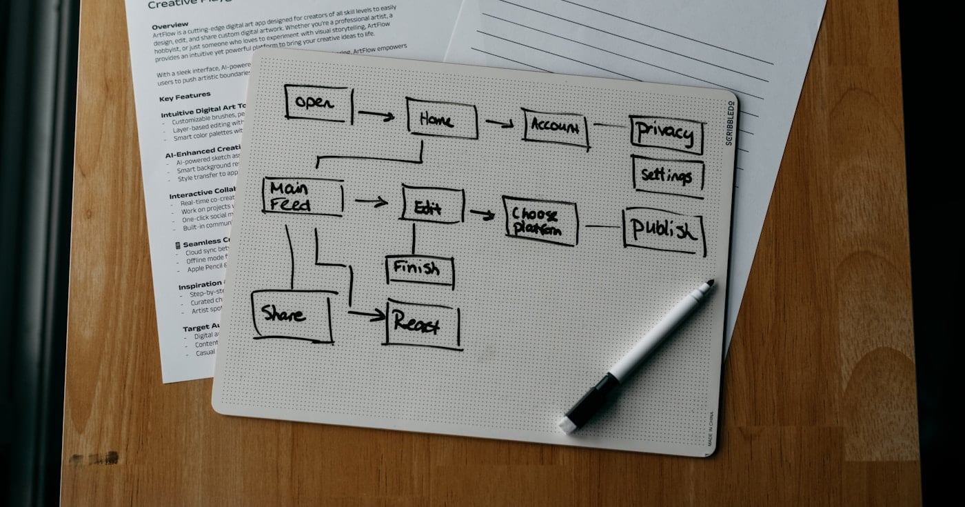
How User Journey Mapping Works: A Complete Framework
A user journey map contains nine core components. Understanding each one before you build your first map prevents the most common structural mistakes.
The User Persona
Every map starts with a specific, research-backed user persona. This is not a demographic sketch. It includes the user's goals, motivations, mental model, technical comfort level, and what they are trying to accomplish in the context of your product.
A persona grounded in real user interviews and behavioral data produces a map that reflects actual experience. A persona built from internal assumptions produces a map that reflects what you wish your users were like.
For products with multiple user types, build a separate map for each segment. A generic "average user" persona produces generic insights that are too vague to act on.
The Scenario and Scope
The scenario defines exactly what goal the user is trying to achieve and when. A good scenario is narrow and specific: "A first-time user trying to complete onboarding in under 10 minutes on a mobile device" is actionable. "A user using the app" is not.
You also choose between two scope types:
- Current-state (as-is): maps the existing experience, based on real user research. Used to identify where things are broken.
- Future-state (to-be): maps the intended or redesigned experience. Used for planning, pitching, and alignment before building.
Maps can be broad (spanning multiple stages from awareness to advocacy) or narrow (focusing deeply on a single stage like checkout or onboarding).
Stages and Touchpoints
The stages are the phases a user moves through to reach their goal. Common frameworks use stages like: Awareness, Discovery, Onboarding, Active Use, Retention, and Advocacy.
Within each stage, you document every touchpoint, every point of contact between the user and your product or brand. This includes app screens, push notifications, emails, in-app messages, help documentation, and support interactions.
A common mistake is only mapping the primary app interface while ignoring email sequences, onboarding checklists, error messages, and support channels. Every touchpoint shapes the experience.
Actions, Thoughts, and Emotions
For each stage and touchpoint, you document three layers.
Actions are the tangible steps taken: click, submit, scroll, read, abandon, return.
Thoughts are the internal questions or doubts: "Do I really need to give my credit card right now?", "Why is this taking so long?", "Is this actually secure?"
Emotions are the user's affective state, typically shown as a curve across the timeline. Emotional peaks and valleys reveal moments of delight and frustration. A dip in the curve at a specific touchpoint is a signal that something needs to be fixed.
Pain Points and Opportunities
Pain points are the moments of friction, confusion, or frustration captured in the emotion curve. They are the direct output of mapping emotions and thoughts, not just actions.
Opportunities are the counterpart: specific, actionable improvements tied to each pain point. A journey map without opportunities is a diagnosis without a prescription. The map's value is in what your team does with those opportunities next.
How to Create a User Journey Map in 5 Steps
Step 1: Define Your User Persona from Real Data
Start by reviewing existing user research: interview transcripts, session recordings, support tickets, analytics, and any prior usability testing.
If you do not have research, conduct it before mapping. Run five to eight user interviews targeting the specific user type you want to map. Ask about their goals, frustrations, and the last time they tried to accomplish the relevant task.
Do not ask hypothetical questions.
Build the persona from what you heard, not what you hoped to hear. Avoid interviewing only satisfied or loyal users. UXPressia's research on common mapping failures found that teams who only interview loyal customers consistently miss the friction that drives churn, because satisfied users had a positive experience and will not surface the problems.
Step 2: Set the Scenario and Goal
Write a one-sentence scenario: who is this user, what are they trying to do, and in what context?
Example: "A product manager at a 50-person SaaS company is trying to create their first analytics dashboard within 15 minutes of signing up."
Then choose your scope. If you are investigating a known problem (slow activation, high churn at a specific point), narrow the scope to that stage. If you are auditing the full product experience for the first time, a broad current-state map gives you the most comprehensive view.
Define success criteria before you map. What would a "good" journey look like? Where do users need to feel confident, not confused?
This framing prevents the map from becoming a list of problems without a direction.
Step 3: Map Every Touchpoint and Action
List every interaction point between your user and the product across the scenario timeline. For each touchpoint, document:
- The action the user takes
- The channel (in-app, email, support, social)
- Any dependencies (does this step require something from a previous step?)
Work from left to right across the timeline. Capture all the touchpoints you are aware of, then validate against session recordings or user tests to catch the ones you missed.
A complete inventory of touchpoints is more valuable than a polished map with gaps. You can always format the map later. You cannot fix pain points you never documented.
Step 4: Capture Emotions and Surface Pain Points
This step transforms a process diagram into a human story. For each touchpoint, capture what the user is likely feeling and thinking based on your research.
Use an emotion curve, a line that rises and falls across the timeline, to make emotional states visible at a glance. Points where the curve dips sharply are your highest-priority pain points.
At each low point on the curve, document the specific thought or friction driving it. "Confused by the permission request on step 3" is actionable. "User feels frustrated" is not.
NNGroup's survey found that 56% of UX professionals created their last journey map using digital tools like Miro or Google Sheets, while 44% used physical tools. Either approach works; what matters is that emotions are captured alongside actions, not as an afterthought.
Step 5: Identify and Prioritize Opportunities
For each pain point, write one or more specific improvement opportunities. Then prioritize them by two dimensions: user impact (how much will fixing this improve the experience?) and feasibility (how hard is it to fix?).
High impact, low effort items belong in the next sprint. High impact, high effort items belong on the roadmap. Low impact items can wait.
Assign ownership before the workshop ends. A journey map that leaves the meeting as a shared Miro board with no owner produces zero change. Each opportunity should have a named person responsible for turning it into a backlog item.
Types of User Journey Maps and When to Use Each
Current-State (As-Is) Maps
Current-state maps document the experience as it exists today, based on real user data. Use them when you are auditing an existing product, investigating a specific drop-off problem, or building a shared baseline before a redesign.
This is the most common type. It answers: "What is the user actually experiencing right now, and where is it failing them?"
Future-State (To-Be) Maps
Future-state maps visualize the intended experience after improvements are made. Use them when you are pitching a redesign to stakeholders, planning a new feature, or aligning a cross-functional team around a shared vision of what "good" looks like.
Future-state maps are hypothesis documents. They show what you intend to build, not what you have validated. Follow them with usability testing to confirm the intended experience holds up.
Narrow vs. Broad Scope Maps
Broad-scope maps cover the full user lifecycle: Awareness, Consideration, Onboarding, Active Use, and Retention. They are valuable for strategic planning and identifying which stage has the most friction.
Narrow-scope maps go deep into a single stage or workflow, such as the checkout flow or the first-session onboarding experience. They are more useful for tactical sprint work where you need specific, actionable insights in a particular part of the product.
Miro is the most widely used collaborative option. Its free plan includes journey map templates and real-time collaboration features that work well for workshops. The Starter plan runs $8/user/month billed annually ($10 billed monthly).
UXPressia is purpose-built for journey mapping and persona creation. The Pro plan at $36/user/month adds unlimited maps, template access, version history, and presentation mode, which makes it strong for consultants and agencies with multiple active projects.
Figma works well for design teams who want journey maps, user flows, and prototypes in a single tool. It requires more setup than a dedicated tool but eliminates context-switching.
Common User Journey Mapping Mistakes to Avoid
Mistake 1: Starting Without a Specific Goal
Creating a map without a defined objective is the most predictable failure mode. Teams that gather for a journey mapping workshop without a stated question to answer produce maps that feel insightful but do not connect to any product decision.
Before your next mapping session, write down the specific problem you are trying to solve. "We want to understand why activation drops off in week two" is a goal. "We want to understand our users better" is not.
Mistake 2: Using Internal Assumptions Instead of User Research
UXPressia's guide on common mapping failures found that teams who skip user research consistently produce maps that reflect internal beliefs, not user reality. The emotions and pain points on the map are invented, not observed.
A map built from assumptions will confirm what your team already believes. A map built from interviews and session recordings will challenge those beliefs and surface problems you never knew existed.
Mistake 3: Interviewing Only Loyal or Happy Users
Loyal customers are more likely to agree to interviews. They also had predominantly positive experiences. If you only talk to them, your map will look rosier than the actual experience for new or frustrated users.
Actively recruit users who churned, never converted, or expressed frustration in support tickets. Their experience reveals what the rest of your funnel looks like.
Mistake 4: Leaving the Emotion Curve Out
Journey maps that document actions without emotions are user flows with extra steps. The emotion curve is what transforms a process diagram into a human experience.
Every dip in that curve represents a place where your product caused anxiety, confusion, or frustration. Each one is a retention risk you can address. Skip the emotion layer and you miss the entire point of the exercise.
Mistake 5: Mapping Too Few Touchpoints
Teams often map only the in-app experience and miss the email welcome sequence, the help documentation, the support handoff, and the re-engagement notifications. Each of those touchpoints shapes the journey.
Map every channel a user might interact with during the scenario. Include touchpoints that are not owned by the product team, such as marketing emails and support responses. A complete picture is more useful than a polished partial one.
Mistake 6: No Action Plan After the Workshop
Journey maps that live in a Miro board and never flow into a product backlog produce no change. NNGroup's research on journey mapping success consistently points to this as the most common way mapping investments are wasted.
End every journey mapping session by assigning ownership to each opportunity. Specify which backlog item it connects to, or create one before the meeting ends. A journey map is only as valuable as the actions it generates.
User Journey Mapping in Practice: Zalora Case Study
Zalora, a major e-commerce platform in Southeast Asia, faced a pattern familiar to many product teams. Users were finding products, adding them to carts, and abandoning before checkout. Analytics showed the drop-off point but did not explain why users were leaving.
Zalora used real-time user journey mapping to map each stage of the purchase flow, including the emotional state of users at critical decision points. The mapping revealed that users at the payment stage were experiencing uncertainty about payment security and delivery timelines. The emotions mapped at that touchpoint showed a sharp dip: anxiety, distrust, hesitation.
With specific pain points identified, the team made targeted changes: surfaced security badges earlier in the checkout flow, added delivery estimates on the product page, and simplified the payment options screen.
The result was a measurable improvement in checkout completion. The lesson applies broadly: analytics tell you where the problem is. Journey mapping tells you why it exists and what to do about it.
Conclusion
A user journey map turns fragmented behavioral data into a shared, human story of how your product succeeds and fails its users. When built from real research and structured around specific scenarios, it is one of the most effective tools a UX team has. It aligns cross-functional stakeholders and surfaces the right improvements to prioritize.
Start with a single persona, a narrow scenario, and five user interviews. Map what you learn. Then act on it.