The Complete Guide to UX Design (2026)
A complete guide to UX design covering principles, the 5-step process, frameworks, tools, metrics, and 2026 trends.
Updated 14 min read
A complete guide to UX design covering principles, the 5-step process, frameworks, tools, metrics, and 2026 trends.
UX design is the practice of creating products that are useful, usable, accessible, and pleasurable to interact with. The field draws from psychology, cognitive science, and human-computer interaction to shape how people experience software, websites, and physical products.
According to Forrester, every $1 invested in UX returns $100, a 9,900% ROI that has made UX a board-level priority.
Coined by Don Norman at Apple in the 1990s, the term now describes a discipline at the intersection of research, strategy, and craft. This guide covers foundational concepts, the 5-step process, core principles, tools, metrics, and the trends reshaping the field in 2026.
UX design is the end-to-end process of shaping how users interact with a product or service. It covers every touchpoint: how information is organized, how tasks flow, how feedback is communicated, and how errors are handled. The goal is to remove friction so users can accomplish what they came to do with minimum effort.
The term "user experience" entered the vocabulary through Don Norman, who defined it broadly to include all aspects of a user's interaction with a company, its services, and its products. UX is not just screens. It includes onboarding emails, support documentation, error messages, and loading states.
The UX vs. UI distinction is the most common source of confusion in the field. Here is the clear version:
A product can have beautiful UI and terrible UX (gorgeous screens that are impossible to navigate). It can also have strong UX and dated UI (frictionless flows with minimal aesthetic polish). The best products invest in both, but UX comes first: structure before style.
The business case for UX is no longer theoretical. 88% of users won't return after a bad UX experience, and 70% of online businesses fail partly due to usability issues. McKinsey found that design-led companies deliver 228% higher returns to shareholders compared to industry peers.
The global UX market reflects this demand. Grand View Research values the market at $5.5 billion in 2024, growing at a 14.5% CAGR through 2030. 72% of Fortune 500 companies now have dedicated UX teams, yet only 14% of companies have reached "optimized" UX maturity.
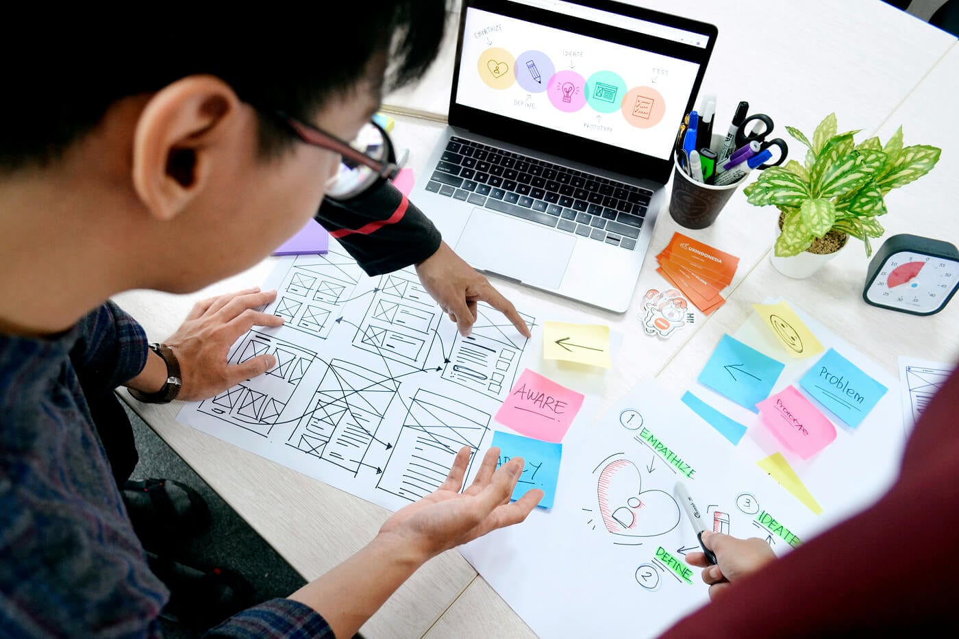
UX design is not a single activity. It is a cyclical process that moves from understanding users to delivering solutions and testing them. The most widely taught framework is the 5-step Design Thinking model, developed at Stanford d.school and popularized by the Interaction Design Foundation.
You cannot design for someone you do not understand. The empathize phase involves qualitative and quantitative research to learn who your users are, what they need, and where they struggle. Techniques include user interviews, surveys, contextual inquiry, and ethnographic observation.
The outputs are user personas and empathy maps that capture attitudes, behaviors, and pain points. Five user interviews per design iteration is the NNG-recommended minimum, after which diminishing returns set in. For complex enterprise products, that rises to 8 to 12 participants per user segment.
Research produces data. The define phase turns that data into a focused problem statement. Teams synthesize interview notes and behavioral data using affinity diagrams and user journey maps.
The output is a clear "How Might We" question anchored in user needs, not business assumptions. A well-formed problem statement names the user, the goal, and the obstacle standing in the way.
"How might we help first-time buyers complete a mortgage application without calling support?" is actionable. "How might we improve the mortgage experience?" is not.
Ideation is structured creative divergence. Teams use design sprints, "How Might We" exercises, and crazy-8s sketching to generate as many solutions as possible before evaluating any of them. Ideas that seem impractical often trigger more practical ones.
According to the Interaction Design Foundation, the goal is to explore the solution space before committing. Good teams separate generation from evaluation deliberately, often with a time box: 20 minutes of sketching followed by a structured critique session.
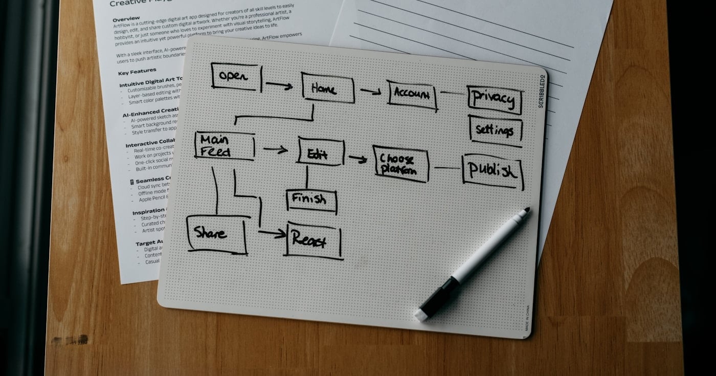
Prototyping converts ideas into testable artifacts. The spectrum runs from paper sketches (lo-fi) to pixel-perfect interactive mockups (hi-fi) built in tools like Figma. The level of fidelity should match the questions you are trying to answer.
Building too much before testing wastes time and creates sunk-cost bias. Teams that spend weeks on hi-fi mockups before the first user session tend to defend their work rather than learn from it. Start lo-fi, test early, and increase fidelity only once the fundamental interaction model is validated.
Testing exposes the gap between what you designed and what users actually do. Moderated sessions let researchers probe motivations in real time. Unmoderated sessions via tools like Maze produce quantitative data at scale.
UX design is iterative: you will run multiple cycles before a product is ready to ship. Research from NNG shows that teams running iterative testing throughout development consistently outperform those that test only at launch, on both task completion rates and satisfaction scores.
Alternative frameworks used in 2026:
Framework | Best For | Phases |
|---|---|---|
Complex problems, uncertain user needs | Empathize, Define, Ideate, Prototype, Test | |
Organizational and service design | Discover, Define, Develop, Deliver | |
Lean UX | Agile teams, startups | Think, Make, Check |
Large products at scale | Happiness, Engagement, Adoption, Retention, Task Success |
Good UX design is grounded in principles validated through decades of usability research. The UX Design Institute identifies seven that govern effective product design.
Every design decision starts with user needs, not stakeholder preferences or technical constraints. User-centricity means returning to research data when debates arise rather than resolving them by opinion or seniority. Teams that build this habit make fewer expensive late-stage corrections.
Predictable patterns reduce cognitive load. When buttons behave consistently and visual hierarchy follows a clear system, users spend less mental energy on navigation and more on their actual task. 68% of large companies have adopted design systems to enforce consistency at scale.
Visual and informational structure guides users through content. What is most important should be most prominent, communicated through size, contrast, spacing, and position.
Eye-tracking studies from NNG show that users follow visual hierarchy cues before reading content. Hierarchy errors cause users to miss critical information even when actively looking for it.
Design adapts to where and how users interact. A mobile checkout flow used at a retail location has different constraints than a desktop dashboard used at a desk. Ignoring context is why desktop-first designs routinely underperform on mobile: the interaction model was designed for the wrong environment.
Users can undo actions, go back, and navigate freely. Irreversible actions require confirmation. Systems that trap users generate the kind of frustration that drives churn.
This principle also applies to notifications. Users who cannot control how and when they receive alerts will eventually disable them entirely or uninstall the app.
Products work for users of all abilities. WCAG 3.0 compliance is now a procurement requirement for enterprise software across the EU, UK, and several US states. Accessibility is not an edge case: captions help in noisy environments, high contrast helps in bright light, and keyboard navigation helps power users.
Every accessibility improvement expands the addressable audience and reduces legal risk simultaneously.
Tasks can be completed with minimum friction. Usability is measurable: task success rates average around 78% across B2B software, and SUS scores above 80 indicate excellent usability. Benchmark your product against these industry standards to identify where to focus design effort.
The tooling landscape has consolidated significantly. Figma leads by a wide margin, with Adobe XD's discontinuation in 2023 pushing much of its user base toward Figma and Framer.
Tool | Best For | Job Listing Mentions | Free Plan |
|---|---|---|---|
Full workflow, collaboration, AI-assisted design | 67% | Yes | |
Code-capable, design-to-development handoff | 8% | Yes | |
Open-source, enterprise self-hosting | 2% | Yes | |
macOS-only teams | 12% | No |
Source: State of Designer 2026 (Figma), UX Tools Annual Survey
Figma's AI features, introduced progressively since 2024, now assist with component generation, auto-layout suggestions, and design-to-code export. These features have reduced time spent on low-level tasks, freeing UX designers to focus on research and strategy.
UX measurement is the link between design decisions and business outcomes. Teams that connect their work to revenue and retention data get more organizational buy-in and larger budgets. The Google HEART framework provides a structured approach to defining metrics at any product scale.
Task Success Rate is the percentage of tasks completed without errors. The industry average for B2B software is approximately 78%, calculated as (successful tasks / total attempted) × 100. Scores below 70% indicate serious usability problems; scores above 90% indicate a top-category product.
System Usability Scale (SUS) is a 10-question post-task survey scored 0 to 100. The industry benchmark is 68, which is average; scores above 80 indicate excellent usability. SUS is the most widely used standardized usability instrument because it takes users about 2 minutes and correlates well with satisfaction and NPS.
Time on Task measures how long users take to complete a specific task. Lower times indicate a more intuitive interface. Tracking this across releases shows whether UX improvements are having a measurable effect.
Error Rate measures the frequency of mistakes during task completion. High error rates in specific flows indicate interaction design problems, not user problems. The goal is to design errors out of the system, not to train users to avoid them.
The Google HEART framework maps UX metrics to business goals using a Goals, Signals, Metrics (GSM) process. Define your UX goals first, then identify the signals that indicate progress, then select metrics that track those signals.
Metric | What It Measures | Example Signal |
|---|---|---|
Happiness | User satisfaction | NPS, CSAT score |
Engagement | Depth of interaction | Session length, feature adoption |
Adoption | New user activation | Week-1 feature usage rate |
Retention | Continued use | 30-day return rate, churn rate |
Task Success | Completion and accuracy | Task success rate, error rate |
This prevents teams from optimizing for easy-to-measure proxies that don't connect to user outcomes. Tracking page views and session length without measuring task completion is a common failure mode.
The discipline is evolving faster than at any point in the past decade, driven by AI integration, regulatory pressure, and the shift toward multi-modal products.
AI is reshaping what UX designers build. Conversational interfaces, predictive navigation, and AI-generated content require new interaction patterns that don't map cleanly onto button-and-form paradigms. UX designers are now responsible for designing trust signals, error states for ambiguous AI outputs, and handoff points between AI and human assistance.
Figma's AI features are simultaneously changing how UX designers work. AI-assisted component generation, automatic design linting, and code export are reducing time spent on production tasks, pushing UX work earlier in the process toward strategy and research.
WCAG 3.0 compliance has moved from best practice to procurement requirement in multiple markets. EU accessibility legislation, UK regulations, and US Section 508 requirements mean that products without accessibility compliance are increasingly locked out of enterprise and public-sector contracts.
Teams that treat accessibility as a retrofit encounter higher costs and longer timelines than teams that design for it from the start.
The most significant organizational change in the discipline is the shift from UX maturity as a cultural aspiration to UX metrics tied directly to conversion, retention, and revenue. UX teams that present their work in terms of task success rates and SUS score improvements are securing larger budgets and more senior stakeholders.
Teams that report only in terms of design outputs (wireframes delivered, prototypes completed) are increasingly being asked to justify their existence.
Beautiful interfaces that are confusing to navigate hurt conversion. 44% of users share bad UX experiences with others, which means usability failures are also brand failures. Use the Jobs-to-be-Done framework to ensure core tasks are friction-free before adding visual polish.
Designing on assumptions is the most expensive mistake in UX. Only 55% of companies conduct any UX testing. Even five moderated interviews per design iteration, the NNG-recommended minimum, reveal the majority of critical usability issues.
WCAG compliance is now a legal requirement in the EU, UK, and an increasing number of US states. Beyond legal risk, inaccessible products exclude users who rely on screen readers, keyboard navigation, or high-contrast displays. Accessibility improvements routinely improve usability for all users, not just those with disabilities.
Page views and session length tell you almost nothing about whether users accomplish their goals. Tracking task completion rates, error rates, and SUS scores gives you actionable data. The HEART framework is a practical starting point for connecting UX metrics to outcomes that matter to your business.
Different terminology, icons, and interaction patterns across sections of the same product create cognitive friction. 68% of large companies have adopted design systems specifically to enforce consistency at scale. A component library in Figma is the minimum viable version for smaller teams.
79% of users scan web pages rather than reading them. Presenting all information at once increases cognitive load and reduces task completion rates. Progressive disclosure, showing only what users need at each step and revealing more on demand, is the standard solution.
Slack is one of the most studied enterprise UX case studies because it made a complex collaboration tool feel intuitive to non-technical users.
Slack's onboarding uses progressive disclosure. New users see a simplified interface and are guided to their first action (sending a message) rather than shown the full feature set immediately. Cognitive load is managed by revealing complexity only when users are ready for it.
Keyboard-first navigation reflects a deep understanding of the power-user persona. Slack's Cmd+K quick switcher lets users jump between channels without touching the mouse, a direct application of the user control principle. This feature is not visible by default, so casual users never feel overwhelmed while power users find it quickly.
The notification system applies hierarchy to attention: urgent mentions are visually distinct from channel activity, which is visually distinct from background updates. Notification design is consistently one of the top drivers of retention in collaboration tools because it determines whether the tool enhances or disrupts a user's workday.
These choices emerged from iterative research and testing, not from a single design decision. Strong UX is built through process, not talent alone.
UX design is the discipline that separates products people use from products people choose. The 5-step process, grounded in the 7 core principles and measured through HEART and SUS, gives teams a repeatable approach for solving real user problems rather than assumed ones.
Run five user interviews on your most critical flow this week and calculate your current task success rate. Both will surface more actionable insight than any internal debate about what users want.
For deeper dives into specific aspects of the discipline, see the UX Crush guides on usability testing, the design thinking process, and prototyping.
Explore 12 real jobs to be done examples from McDonald's to Meta, each paired with measurable business outcomes. Learn how JTBD drives product strategy.

A practical field guide to qualitative research for UX and product teams. Covers method selection using the NN/G 3D framework, sample sizes, thematic analysis, bias mitigation, and the 2026 AI platform landscape.
Design thinking is a human-centered approach to innovation. Learn the 5 stages, real-world examples, and how to apply it to your UX work.